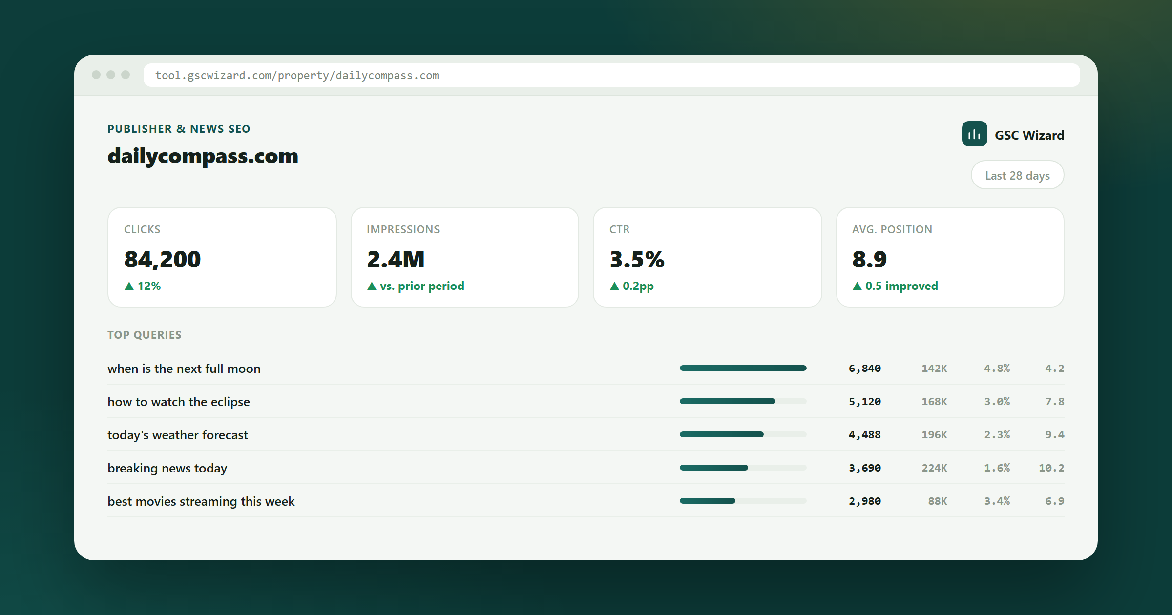
Publisher SEO
News desks measure the spike. The money is in what happens after it. GSC Wizard tracks the decay curve of every article you have ever published, separates evergreen from news, and tells you which back catalogue pieces are one update away from ranking again.
Built for archives with tens of thousands of URLs - no 1,000-row export ceiling.
The archive nobody reports on
Your back catalogue is a bigger traffic asset than this week's homepage - and nobody is watching it.
A publisher with 40,000 articles has 40,000 assets quietly losing rank. Refreshing the 50 that are decaying fastest beats publishing 50 new ones, costs a fraction as much, and is invisible in any report built around 'top pages this week'.
Publisher SEO has a volume problem before it has an analysis problem.
Search Console's UI caps what you can see, so every export is the same few hundred head pages. The 39,000 articles below the cut - which together are most of your traffic - never appear in a single report. You end up optimising the pages that need it least.
A news piece dropping 90% in four days is healthy. An explainer dropping 90% over four months is a fire. Sitewide decay reporting flags both or neither. Without splitting the two, alerts are noise and get muted within a month.
An update takes your health vertical and leaves politics untouched. Sitewide clicks dip 8% and nobody can point at a cause. By the time you have manually sliced it by folder, the recovery window is half gone and the editorial team has already blamed the redesign.
Section-level reporting first, then decay at scale, then change detection with dates you can defend.
Content groups map /health/, /politics/, /reviews/ and your evergreen hubs into segments. Every report then answers 'which desk moved', which is the only question an editor-in-chief actually asks.
The content decay map scores every URL with history, not just the ones that fit an export. On a large archive that routinely surfaces two-year-old explainers still on page one but sliding - the cheapest refresh work you will ever ship.
Instead of eyeballing charts after a core update, change-point detection finds the statistical break in each section's series and gives you the date. Line that up against the algorithm update timeline and the argument ends.
Large properties get sampled and anonymised queries stripped, so totals never reconcile. The sampling impact report quantifies the gap for your property so you know which numbers to trust in a board deck.
One page. Written for an editor, not an analyst.
EDITORIAL SEARCH BRIEF - week 34

BY DESK              clicks      vs 4wk avg
  /health/           412,900     -14%   <- investigate
  /politics/         388,100      +3%
  /money/            201,440      +7%
  /reviews/          156,220      -2%

CHANGE POINT DETECTED
  /health/  break on 12 Aug, -19% step change, high confidence
  Overlaps the August core update window.

REFRESH QUEUE - evergreen, still ranking, still sliding
  1. /health/vitamin-d-guide        pos 4.2 -> 7.8   9,400 clicks lost
  2. /money/isa-explained           pos 2.9 -> 5.1   7,100 clicks lost
  3. /health/sleep-apnea-symptoms   pos 6.0 -> 9.4   4,880 clicks lost

NEWS COHORT (published this week) - normal decay curve, no action
The refresh queue is the deliverable. Three URLs a week, ranked by clicks lost rather than by traffic size, is a sustainable editorial habit.
Article half-life by desk
How long a piece takes to fall to half its peak clicks. It tells you what a story is worth over its life, not on day one, and it differs wildly between sections.
Evergreen click share
The share of clicks coming from articles older than 90 days. When this falls you are on a publishing treadmill, replacing traffic rather than compounding it.
Clicks lost to decay
Sum the gap between each URL's current and peak run rate. This is the number that justifies a refresh desk in a budget meeting.
Section-level position drift
Average position per desk, tracked weekly. Core updates land on sections, so this is where you see them first - usually before clicks confirm it.
Yes. Historical performance data for full storage properties is kept in a column store built for this, not in the Search Console UI, so decay, cannibalization and clustering run across the whole archive rather than the top 1,000 rows the export gives you.
Split them with content groups. News sections get their own baseline where a steep drop is expected and normal, while evergreen hubs get a baseline where a steep drop is an alert. Same report, two different definitions of 'wrong'.
It gives you the two halves of the argument: change-point detection dates the statistical break in each section's traffic, and the algorithm update list tells you what Google shipped around that date. You still make the judgement, but with a date instead of a hunch.
Google samples large properties and removes rare queries for privacy, so query-level rows will not add up to the property total. The sampling impact report measures that gap on your own data so you can report a number you can defend.
Written by Jan-Willem Bobbink · Published August 26, 2026
Creator SEO
One hour a week, three posts refreshed. That beats publishing more, and it is the whole routine.
Affiliate SEO
Position 3 with a bad title loses to position 5 with a good one. CTR is the affiliate's cheapest lever.
Education SEO
Forty departments publish independently and nobody owns the site. Report per department or not at all.
Connect Search Console and get the decay map across every article you have published, not just the ones that fit an export.
Practical GSC and GA4 workflows, product updates and SEO experiments. No spam, unsubscribe anytime.