Data Studio connector
Twenty-seven Search Console, GA4, Bing, and Core Web Vitals reports in your own Data Studio dashboards, including several that Google’s own connectors cannot produce.
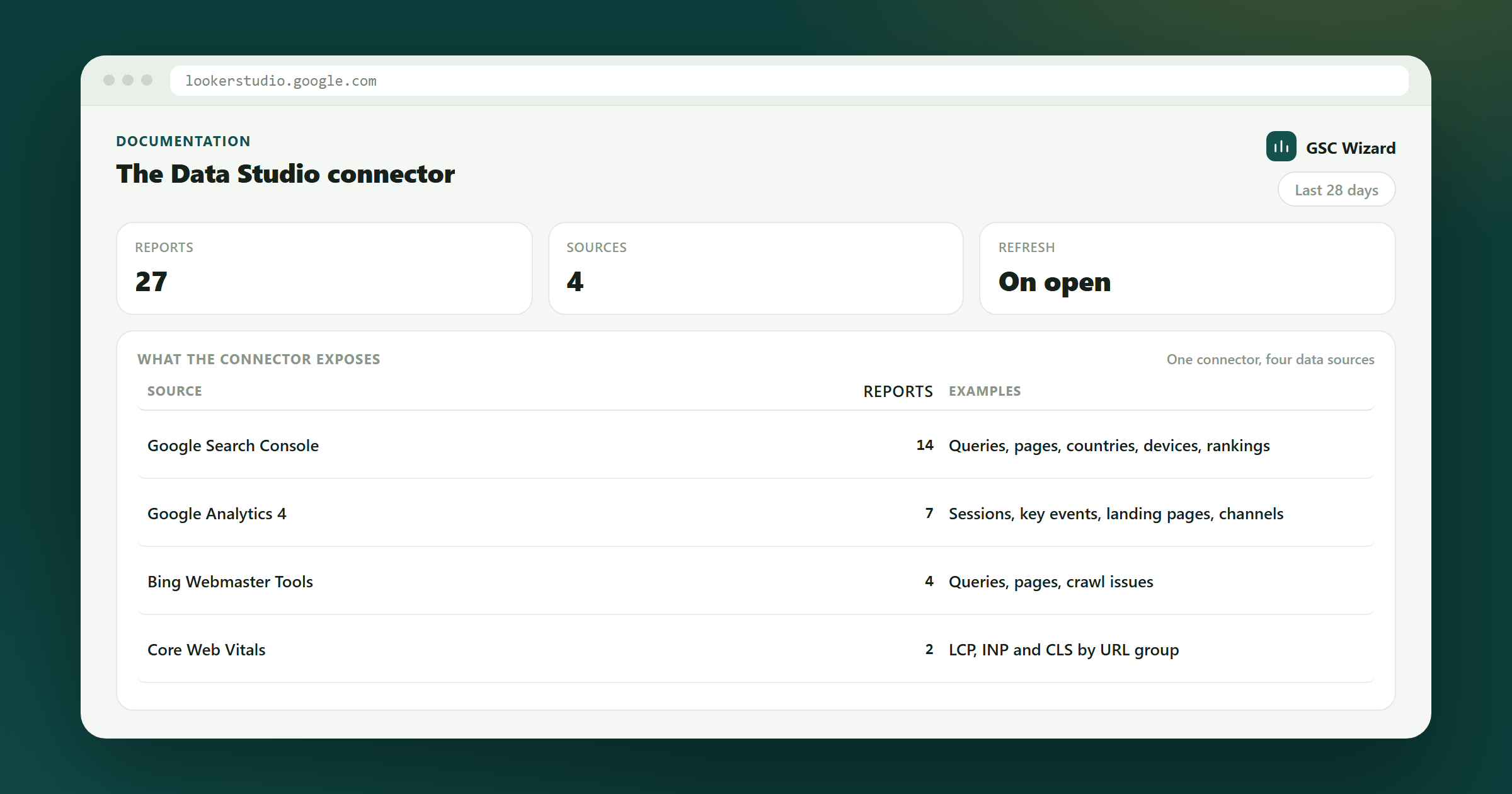
Available on request. The connector is being trialled with a small group before it is listed publicly in the Data Studio gallery. Ask us for the connector link and we will send it over.
What it adds
Google publishes free Data Studio connectors for Search Console and GA4, so we deliberately do not duplicate them. The native Search Console connector gives you two tables, Site Impression and URL Impression, capped at 16 months, and it cannot combine query with landing page at all. Everything this connector serves is something those cannot do: a Search Console and GA4 join, a grouping you defined in GSC Wizard, a computed analysis, index-state data, or Bing.
Numbers match the app. Each report runs the same code as the equivalent GSC Wizard report, so a table here and the same report in the app will agree for the same property and date range.
Connecting it
You need an active subscription and about two minutes. Each report is a separate data source, so pick the one you want first, then repeat for the others.
- In GSC Wizard, go to Account → API keys and create a key. Read only scope is enough, and is what we recommend: a read key cannot change anything in your account, so a dashboard shared with a client can never write to it.
- Copy the
gscw_live_…key. It is shown once, at creation. - Open the connector link and authorise it for your Google account. Until Google verifies the connector, it shows an “unverified app” screen; click Advanced and continue.
- Paste the key, choose a Report and a Search Console property, set Date granularity if you want a time series, then click Connect.
The report choice is fixed when the data source is created. To chart a different report, create another data source and pick it there. You can use as many as you like in one Data Studio report.
The reports
Grouped by what they are for.
Search Console and GA4, blended
Query value attribution gives estimated sessions, key events, and revenue per search query. Landing pages, blended joins Search Console and GA4 per landing page, with sessions, bounce rate, key events, and revenue alongside clicks and position. Both need a GA4 property linked in GSC Wizard.
Your own groupings
Content group performance and Topic cluster performance report against the groups and clusters you defined in GSC Wizard, with a previous-period comparison. Nothing native can group your pages the way you have.
Computed analyses
Decaying content, Keyword cannibalization, Ranking changes (new, lost, improved, declined in one table), Opportunity scoring, Page poaching opportunities, Position distribution, Long-tail clusters, Query shapes, Folder / subdomain breakdown, and Branded vs non-branded as a daily series.
Indexing
Tracked URLs gives the current index state per URL, and Gained / lost pages shows what entered and left the index over the window. Search Console has no connector for indexing data at all.
Bing
Queries, pages, query × page pairs, daily traffic, daily crawl stats, crawl issues, inbound link counts, and keyword research. Bing has no Data Studio connector of its own, so all of it is additive. Needs a Bing Webmaster API key saved in GSC Wizard.
Other
Core Web Vitals field data from CrUX per metric per period, Sitemap performance per URL for one sitemap, and a Cross-property summary covering every property on your account at once, which native connectors cannot do because they bind a data source to a single property.
Charting a report over time
Every report the date range drives has a Date dimension, so you can put it on a time series instead of only a table or a scorecard. How that Date is filled is up to you: the data source has a Date granularity setting, and you can change it per chart.
- Whole date range (the default) gives every row the same date, which is what you want for tables, scorecards, and top-N lists. One period, one refresh.
- Daily, Weekly, and Monthly split the range into periods and give each row the date of the period it belongs to. Weeks start on Monday and months follow the calendar, and the first and last period are trimmed to your date range.
The classic use. Take Query value attribution, filter it to your non-branded queries, set Date granularity to Monthly, and chart Date against Est. revenue as a time series: estimated revenue from non-branded search, month by month. The same trick turns any report here into a trend: content group clicks per week, cannibalized queries per month, Bing position over time.
The two blended reports are free to chart. Query value attribution and Landing pages, blended build the whole series server-side, so a twelve-month monthly chart costs exactly one request, the same as a single table. Reach for a fine granularity on those without thinking about it.
Every other report is split by the connector, one request per period, because the underlying reports return a single total for whatever range they are given. There, finer granularity means more refresh time and more of your API allowance: 40 periods per chart is the maximum, and a year of daily periods will be refused with a note asking for a coarser setting. Monthly over a year is 12; weekly over a quarter is 13. Results are cached for six hours per period, so a page full of charts on the same setting only pays for it once, widening a report from three months to twelve only fetches the nine new months, and if a refresh does hit the rate limit the connector waits and retries rather than breaking the chart.
Reports that already have a Date of their own (the daily Bing series, Branded vs non-branded, Gained / lost pages, and Core Web Vitals) use it and ignore the setting. So do the current-state lists (Tracked URLs, Bing crawl issues, Bing inbound links) and the cross-property summary, which have no period to attach. On reports with Prev fields, such as content groups and ranking changes, each period compares against the period before it, so a monthly series gives you real month-on-month deltas.
Field reference, report by report
Every report ships a fixed set of fields, listed below with the exact names you will see in Data Studio’s field picker. Dimensions (green) are the text and date columns you group by; metrics (blue) are the numbers, each with a sensible default aggregation already set, so dropping them on a chart just works. Data Studio’s automatic Record Count metric is also always available when you just want to count rows.
Three conventions to know. CTR fields arrive as 0–100 (12.3 means 12.3%), except Bounce rate, which comes straight from GA4 as a 0–1 fraction: give it the Percent type and it displays correctly. Position is lower-is-better, so sort it ascending, and a negative Position delta means the ranking improved. Counting fields such as Pages, Competing pages, and Keywords aggregate with MAX rather than SUM, so totals never double-count.
Search Console and GA4, blended
| Report | Dimensions | Metrics |
|---|---|---|
| Query value attribution | Date, Query, Top page | Clicks, Impressions, Est. sessions, Est. key events, Est. revenue, Pages |
| Landing pages, blended | Date, Landing page | Clicks, Impressions, CTR, Avg position, Sessions, Active users, Bounce rate, Key events, Revenue |
Your own groupings
| Report | Dimensions | Metrics |
|---|---|---|
| Content group performance | Date, Content group | Clicks, Impressions, CTR, Avg position, Pages, Click share, Prev clicks, Prev impressions, Prev avg position |
| Topic cluster performance | Date, Topic cluster | Keywords, Clicks, Impressions, CTR, Avg position, Matched queries, Click share, Prev clicks, Prev avg position |
Computed analyses
| Report | Dimensions | Metrics |
|---|---|---|
| Decaying content | Date, Page or query, Severity | Recent clicks, Baseline clicks, Click change %, Recent impressions, Baseline impressions, Recent position, Baseline position, Position delta |
| Keyword cannibalization | Date, Query | Competing pages, Clicks, Impressions, Entropy (higher = clicks split more evenly) |
| Ranking changes | Date, Query or page, Movement (new / lost / improved / declined) | Clicks, Impressions, CTR, Position, Prev clicks, Prev impressions, Prev position, Position delta |
| Folder / subdomain breakdown | Date, Path, Host, Subdomain | Clicks, Impressions, CTR, Avg position, Pages |
| Position distribution | Date, Position bucket | Clicks, Impressions, CTR, Rows, Impression share, Click share |
| Long-tail clusters | Date, Cluster, Description | URLs, URL %, Clicks, Click %, Impressions, Impression %, Avg CTR, Avg position, Avg query diversity |
| Opportunity scoring | Date, Query | Opportunity score, Potential clicks, Clicks, Impressions, CTR, Avg position |
| Page poaching opportunities | Date, Query | Potential clicks, Clicks, Impressions, CTR, Avg position |
| Query shapes | Date, Query shape, Description | Queries, Clicks, Impressions, Share of queries %, Share of impressions %, Zero-click queries, Avg position |
| Branded vs non-branded, daily | Date | Branded clicks, Non-branded clicks, Branded share |
Indexing and cross-property
| Report | Dimensions | Metrics |
|---|---|---|
| Tracked URLs | URL, Status, Verdict, Coverage state, Indexing state, Warning, Last crawled, Last checked | Checks |
| Gained / lost pages | Date, URL, Change (newly indexed / lost), Changed at, Detail | Pages (1 per row, so it sums to a page count) |
| Cross-property summary | Property, Data source | Clicks, Impressions, Prev clicks, Prev impressions |
Bing
| Report | Dimensions | Metrics |
|---|---|---|
| Bing: queries | Date, Query | Clicks, Impressions, CTR, Avg position |
| Bing: pages | Date, Page | Clicks, Impressions, CTR, Avg position |
| Bing: query × page pairs | Date, Query, Page | Clicks, Impressions, Avg position |
| Bing: daily traffic | Date | Clicks, Impressions |
| Bing: daily crawl stats | Date | Crawled pages, In index, Inbound links, 2xx, 301, 302, 4xx, 5xx, Blocked by robots.txt, Crawl errors, Contains malware |
| Bing: crawl issues | URL, Issues, HTTP code | Inbound links |
| Bing: inbound link counts | URL | Inbound links |
| Bing: keyword research | Date | Impressions, Broad impressions |
Other
| Report | Dimensions | Metrics |
|---|---|---|
| Sitemap performance | Date, URL | Clicks, Impressions, CTR, Avg position |
| Core Web Vitals (CrUX) | Period end, Metric, Is Core Web Vital, Unit | P75, Good density |
Example tables and charts
Recipes for the charts we build most. Each names the report to create the data source from, then the exact fields to drop where. Mix several data sources on one page freely; a Data Studio report is not limited to one.
Revenue by keyword
Query value attributionThe classic “which keywords make money” table. Add Top page as a second dimension to see which URL earns it. The same table in the app (Blended → Query Value Attribution) should match it exactly.
Non-branded revenue, month by month
Query value attributionThe chart the connector could not draw before: estimated organic revenue from non-branded search over time. This report builds the series server-side, so the whole twelve months costs one request. Add a scorecard on the same source with granularity left at Whole date range for the period total beside it, and swap the metric for Clicks or Est. key events to trend volume or conversions the same way.
Pages that win clicks but lose visitors
Landing pages, blendedSet the heatmap on Bounce rate (typed as Percent). Rows with high clicks and a hot bounce cell are pages whose search snippet promises something the page does not deliver.
Branded vs non-branded trend
Branded vs non-branded, dailyGrowing non-branded volume is SEO working; growing branded volume is brand marketing working. Add a scorecard with Branded share next to it for the one-number version. Needs branded keywords saved in Property Setup.
Biggest ranking losses
Ranking changesSorting by Prev clicks ranks losses by how much traffic was at stake, not by how dramatic the position swing looks. Four copies of this table, one per Movement value, make a complete winners/losers board from a single data source.
Position profile
Position distributionShows at a glance how much visibility sits on page one versus beyond it. The gap between the impression bar and the click bar in positions 4–10 is your striking-distance upside.
Core Web Vitals trend
Core Web Vitals (CrUX)Because LCP is milliseconds and CLS is a unitless score, mixing metrics on one axis gets unreadable; filter to one Metric per chart when it does. A companion chart of Good density (typed as Percent) gives the share of visits rated good.
Agency portfolio overview
Cross-property summaryOne table covering every property on the account; the report’s date range sets the window length. Scorecards on the same source sum the whole portfolio. Native connectors cannot make this page at all.
Index watchlist
Indexing tracker (both reports)The pie gives the current index-health split; the lost-pages table names exactly what dropped out and when. A scorecard on Pages with the same filter counts the losses.
Bing crawl health
Bing: daily crawl statsA growing 4xx or 5xx band inside the crawl mix is the earliest visible sign of a crawl problem. Overlay Crawled pages as a line on the right axis for total crawl volume.
Calculated fields worth adding
The connector ships raw numbers; these four Data Studio calculated fields cover most of what dashboards add on top. Create them on the data source (Resource → Manage added data sources → Edit → Add a field) so every chart can use them.
- Change %:
(Clicks - Prev clicks) / Prev clicks, typed as Percent. Works on every report with Prev fields: content groups, topic clusters, ranking changes, and the cross-property summary. This gives you period-over-period deltas without Data Studio’s own comparison feature. - CTR as a real percent:
CTR / 100, typed as Percent, because the connector’s CTR fields are 0–100. (Bounce rate is the exception: already 0–1, just set its type to Percent with no formula.) - Revenue per click:
Est. revenue / Clickson Query value attribution, typed as the GA4 property’s currency. Ranks keywords by value density instead of raw volume. - Estimated conversion rate:
Est. key events / Est. sessionson Query value attribution, typed as Percent. Surfaces queries that convert far above or below the site average.
Reports that behave differently
Most reports follow the property and date range you pick. A few do not, and their names say so in the dropdown.
- Tracked URLs, Bing crawl issues, and Bing inbound link counts are current-state lists, so they ignore the date range and have no Date dimension.
- Gained / lost pages covers a window counted back from today, sized by your date range but capped at 90 days; Cross-property summary is capped at 180. Both caps are shown in the report dropdown. Gained / lost pages dates each row by the day the change was recorded, so it charts as a time series without the granularity setting.
- Cross-property summary covers every property, so it ignores the property picker too.
- Core Web Vitals uses CrUX’s own rolling 28-day periods rather than your date range.
- Sitemap performance and Bing keyword research each need one extra field filled in, Sitemap URL and Keyword. Both boxes are always visible; fill in the one your report needs.
How the revenue estimates are made
This applies to Query value attribution specifically. The attribution works at page level, by proportional click share: if a query brought 80% of a page’s Search Console clicks, it is credited with 80% of that page’s GA4 sessions, key events, and revenue.
These are estimates, not measurements. Google never joins a query to a session, so nobody can give you measured revenue per keyword. Treat the numbers as directional: good for ranking queries against each other and spotting where value sits, not for invoicing. Differences in device, country, and timing between the two data sets are invisible to the method, and every click is treated as equally likely to convert.
Organic only
The two blended reports distribute only google / organic GA4 sessions by default, which is the closest match to what Search Console measures. Untick Organic sessions only to distribute all traffic instead, which inflates the numbers but can help when your GA4 channel grouping is unusual. The setting has no effect on the other reports.
Freshness, quotas, and limits
The connector caches each request for six hours, so a report full of charts costs one API call rather than one per chart.
- Set the data source’s data freshness to 12 hours. Search Console data updates once a day, so a shorter interval buys you nothing and burns quota.
- The GA4 quota is shared per property, including with any Google GA4 connector already in your reports. An over-eager refresh setting here can slow those down too.
- Very large sites are truncated. The blended reports pull up to 25,000 rows from each side; Query value attribution returns the top 5,000 and the table-style reports up to 1,000 rows each (per period, when a Date granularity is set). Where a report estimates rather than measures, matchedClickShare in the data tells you how much of your click volume the estimates actually cover.
- Date granularity is the biggest lever on how much a report costs to refresh: one request per period, capped at 40 periods per chart. Leave it on Whole date range for tables and scorecards and reach for Monthly or Weekly only on the charts that need a trend.
- API calls are rate limited per account, and the connector gets its own budget separate from any Claude or ChatGPT usage on the same account, so a busy dashboard cannot starve your assistant. If a refresh does trip the limit the connector waits and retries automatically; only when that does not clear it will you see a message asking you to wait a minute, rather than a broken chart.
- A report needing something you have not set up, a GA4 property, a Bing API key, or branded keywords, explains what is missing instead of returning an empty chart.
Prefer not to use a connector? Every report in GSC Wizard exports to CSV. Drop one in Google Sheets and use Data Studio’s built-in Sheets connector. See Exporting data.